Splitting a power bi line chart up into several lines based on year.
Updated
•1 min read
V
Self-taught Data Analyst specializing in Power BI
using Power query or DAX
Sales data
for the first example, we have a generic sales dataset.
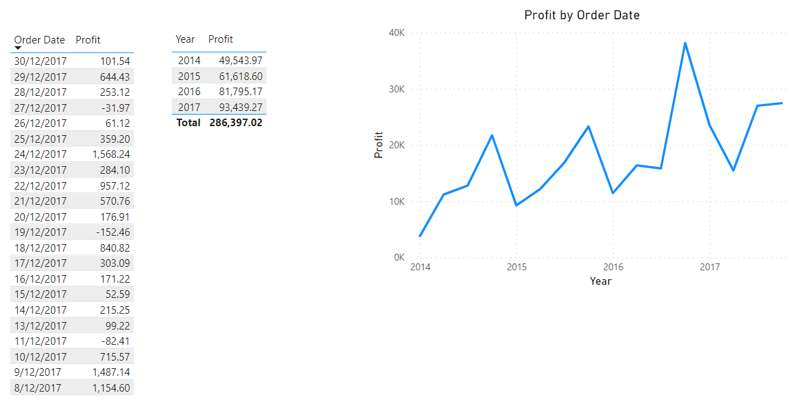
It has Order date and Profit etc columns plus 4 years' worth of data.
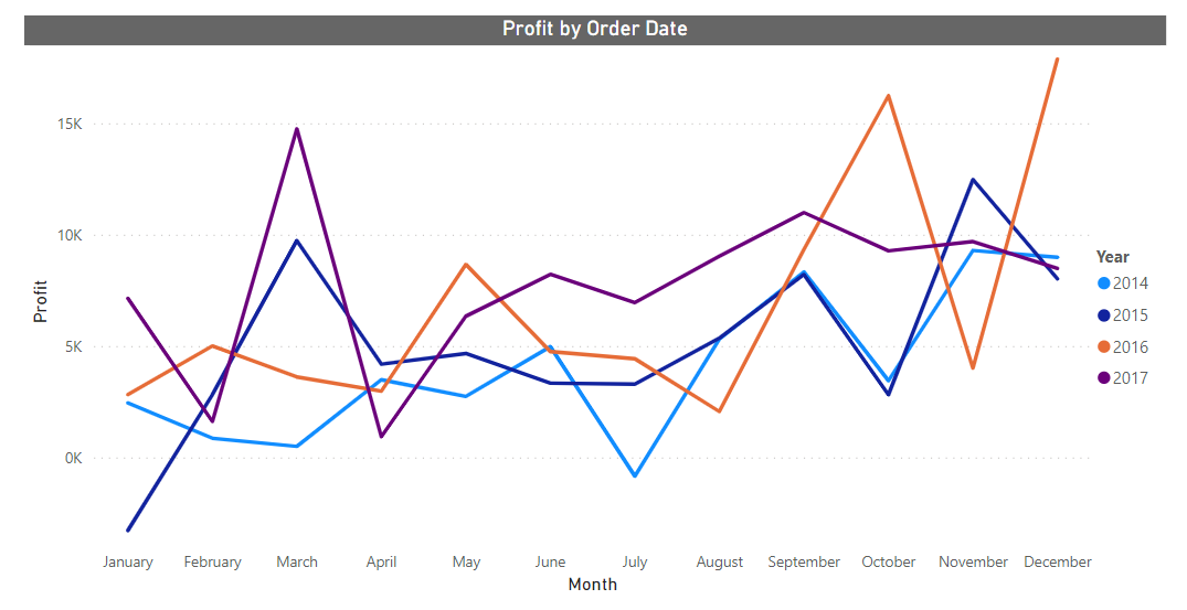
We can add these 2 columns to a line chart (or any chart ) can visualize sales profit throughout the year
we need to make a line chart with 4 lines to represent each year.
The Easiest way
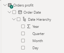
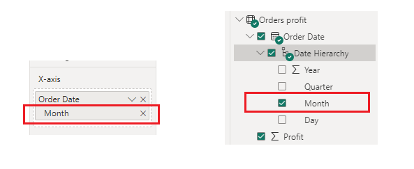
For this, the order date should be in date format.
- Add profit column to Y-axis
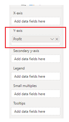
- add order date to X-axis and reduce hierarchy to month.
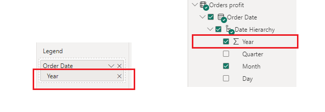
- add order date to legend and reduce hierarchy to year.
here is the chart.